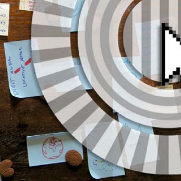
For those not familiar, Prezi uses a map-like metaphor for creating presentations instead of a slideshow metaphor. This makes it possible to create non-linear presentations, or presentations that use spatial metaphors for organizing ideas, like mind maps.
The new UI took a second to get used to, but I think it will be easier for new users to get started. One thing I liked about Prezi to begin with is that unlike PowerPoint and other Office apps, the features aren’t “hidden” in menus, and the new version makes it even easier to find different options.
The web version of Prezi is free, but if you want the desktop version or certain other features you’ll have to shell out for the Pro account, which costs $159 a year. But even free users can use the offline presentation viewers, so you never have to worry about shoddy conference Wi-Fi when giving a presentation. You can also use it for giving online presentations, bypassing the need to use WebEx.
The company was co-founded by Hungarian architect/artist/designer Adam Somlai-Fischer, who had been using custom code for giving Prezi-style presentations for years before starting the company. After enough people asked him how they too could create presentations like his he teamed up with Peter Halacsy and Peter Arvai to start the company in 2009.
Last year Prezi raised a $14 million Series B led by Accel Partners. Previously it raised Series A financing from Sunstone Capital and landed Dorsey as an adviser.


